Friday, 24 April 2015

Representations of National Identity  

Pride (2014)-


The first noticeable representation would be the non-diegetic sound of choir music, as stereotypically the welsh are well known for their famous choir singers such as Charlotte Church, and for their love of choirs in general. This is instantly associated with Welsh people so it sets the scene before we even see any locations. When we do see a location it is first of the countryside, as Wales is mainly made up of fields and farms and less of city buildings. In the fields are sheep, which again are pinned with Wales because they are famously known for having lots and lots of sheep- this mise-en-scene is very stereotypical. Linked with this establishing shot is the text "deep in the valleys" which is a typical saying for Welsh people and is instantly recognisable.
A famous 'landmark' associated with Wales is shown through an establishing shot, this would be the Severn Bridge that leads to Wales from England and is the main way for most people to get to Wales.

Welsh people are well known for their sense of community as they typically live in small towns and villages spread across the countryside. To represent this there are two shots at the beginning of the scene that show a popular community centre. First a long shot showing the sheer amount of people in this club, they are all talking which shows that they are a tight community- this links with our stereotypical idea of Wales as we believe because of these small communities they all know each other. The second shot is a mid shot of a few men talking and laughing together, which shows their community spirit, again associated with the Welsh.

However this small community means they tend to have closed minds when it comes to new subjects such a homosexuality, especially the older generations. They are more ignorant towards the LGBT community as one of the young men had to be forced to speak to one of the members. This is showing that the welsh are not only small minded, but also perhaps stuck in their old ways and are not open to different sexuality. Further on in the trailer someone says it is "embarrassing" to have the members of the LGBT community sleeping on there floor, this shows their unwelcoming attitude towards gay people. 

Challenging the stereotype, would be the second half of the trailer when the welsh people become friends with the LGBT community as they are portrayed as anti gay at the beginning. There is a mid shot of the young man who previously wouldn't speak to a gay person now shaking hands with him, showing their unity.


 American Oxygen (2015) Rihanna -  


An overall message I get from this music video is that despite all the negative actions that have happened within America and that the negative implications that their country has had as others, we can go froward as a strong nation into a positive future. All the violence has led us to where we are now, positive outcomes have occurred such as freedom for black people and humans travelling to the moon.  This video seems very patriotic and it shows America as a nation in unity. The American flag shows this as it is their national identity, and despite all the negatives she still seems proud to stand  in front, perhaps not proud necessarily but she will defend her country and America is what it is, they can't change the past now but only strive for a better future. This idea for a stronger future is portrayed through the use of children and the youth as they are the next generation. The use of mixed race children shows that despite the wars between blacks and white we are now at a point to work together to secure our future. The use of the 'American dream' is very apt for this video/ song because that wasn't all it turned out to be, their dream was of  riches and lots of land but in reality they had to work really hard for very little. This message comes through in the sense of America as a whole because though most other nations think that America now has all these glorious moments, there has been lots of negatives as well such as the racial wars and the bombing of Hiroshima. 

It begins seemingly positive for a close up of Obama swearing the oath of loyalty as he becomes president, this is very positive because it portrays the end of the racial wars and proves the rights black men have now in America. However a film of men marching, presumably into war, is laid over the clip of Rihanna singing in front of the American flag, this could have two connotations, one that they have fought for what they got and consequently they deserve it or two that war has negative connotations due to the loss of life and violence. There is a lot of violence in this music video showing the struggles America has faced and how they have been divided at times. The amount of fire used also gives negative connotations because people tend to think of danger when they see fire, and ultimately death. The repetition also leads us to think about how America has repeatedly hurt other countries and damaged each other as well. 

The colour scheme of Rihanna's outfit, mise-en-scene, also adds to the idea of patriotism as she is wearing a red and white belt, red lipstick, red nail polish, blue tinted hair, a white top and blue jeans- all colours which are displayed on the American Flag and the colours that people associate with the USA. 

There is a complete mix of both positive and negative events and outcomes concerned with America. Some of the main positives portrayed in this video include: the landing on the moon, the empire state building, the fame it has offered the Beatles, Obama becoming president, Martin Luther King giving freedom to the blacks and slaves and the infamous stock markets on Wall Street.
However some negatives include: the bombing of Hiroshima and Nagasaki, the events of the twin towers, the abuse of slaves and blacks, the problems of immigrations, the great depression, homelessness and riots. 

Through this music video Rihanna is portraying America as it is, and not holding back, challenging the stereotypes we have that America is always happy and positive but also agreeing to some of our stereotypes concerning their violence and involvement in war.


Tuesday, 21 April 2015

Representations of Events  

The Political Debate

Daily Mail-


Through the language the media producers of the Daily Mail are attempting to associate the labour party, and more specifically party leader Ed Miliband, with terrorists. Saying that the runaway's father is a 'labour activist' associates the party with something most Britons perceive as negative. 

The Daily Mail have taken this connection completely out of context, because through the use of the main image being Ed Miliband with the father it is focusing on the fact that Ed has 'associated' himself with terrorism, instead of focusing on the real story which is the fact another briton has attempted to cross to Syria. Ed Miliband took a photo with a supporter of his party, this does not mean he has anything to do with supporting terrorism or jihadis. In the image Miliband is smiling, which again suggests he seems happy to be associated with such a link, which increases the negativity this story will provide the party. The inset picture is the image of the 'runaway' jihadi Waheed Ahmed, the image is a lot smaller meaning there is less focus on this and consequently more on the bigger image of Ed and Ahmed's father. 

The Daily Mail is a nationalist paper, meaning they are very patriotic, which is understandable as to why they want to create negativity for their opposing party. These right-wing values come through in the stories and possibly cause influence to the readers which would consequently mean more support for their own party and less for Labour. The audience would be majorly nationalist too 

The paper takes a more formal tone which highlights the seriousness within this particular story and perhaps make it more shocking to the readers because it seems more serious. There is no colloquial language here but instead talking about a serious topic with phrases such as 'Syria border', 'Runaway Jihadi' and 'Labour Activist.


i-

This newspaper takes a more neutral stance, and we can tell this by the visual codes, such as the text, the image and subtext. The text is less specific to a certain party and doesn't have any negative connotations like the other newspaper. 'Dawn of rainbow politics' is a title that suggests the article will focus more on the event as a whole and less on targeting specific groups or politicians. The image reiterates this because instead of it being an image of a single politician it is of all the politicians at the debate, which again shows neutrality because there is not a preference to one over the other. The subtext talks about the "seven party leaders" which anchors the main image. Even though the main page picks on certain leaders such as "Farage", "Cameron" and "Miliband" , it is because they were the leading politicians after the debate, so it is in context and less of a direct attack.

The 'i' newspaper takes a formal approach, using language that will appeal to the majority of her audience, as the subject is of a serious matter and the newspaper is a formal one also. The image is in colour which perhaps shows a more positive outlook on our future and the outcomes of the upcoming election. The podiums also show the colour specific to their party, and as we can see most of the representative colours, it allows us to see that this is a more neutral newspaper. The 'i' newspaper is a liberal newspaper, meaning it stands just left of the centre on the political spectrum, mainly discussing social issues and inequality. Having said this the 'i' prides itself on its balance when publishing stories and, discusses points of view from both left and right.


The Oxford vs. Cambridge Boat Race

The Telegraph


Boat Races 2015: Oxford and Cambridge crews – men and women – go head to head: live blog


This is the main image for the live events 'as it happened' for the Boat Races 2015 published under the Telegraph. The image is neutral as it shows an image including both teams and both the men and the women. This year's race held historical importance as it was the first time the men and women raced on the same day and coverage was given to both. The image represents this in a simple form, it is not showing them as one higher than the other but of equal importance, which is a significant factor for this years race. Gender equality is also tackled in this image for the men and women are shown in the same stance and same clothing, meaning they're also equal. This image shows the teams in their particular colours, which are recognisable for the major fans who follow the teams, but also distinguishable for those who don't; hence the newspaper is reaching a wider audience. The oars are in the picture as well, showing to those who don't know the sport that the newspaper is going to cover. The location also hints to the sport as they're standing on the edge of the water, the Thames, which is where the action takes place. The title 'Boat Races 2015: Oxford v Cambridge: as it happened ' is informative and gives the basic information, which familiarizes the readers on the topic. The word 'Races' highlights the fact that this year will be significant in terms of gender quality, however it is not really properly picked up on, perhaps because the paper is more neutral and comments on topics from both angles it is leaving the readers to make their own interpretation on whether this is a positive aspect to this infamous race or not.
The event is being represented as a team sport, which it very much is, but also team in a bigger sense because you have the universities Oxford and Cambridge going head to head. Both the universities are portrayed as competitive, especially as this is a "historic" event, meaning it has occurred very frequently in the past. The costume they are wearing is also very specific to the race and very professional looking, suggesting they compete to a high standard and they taken this sport seriously- linking with their competitiveness.


Metro-


Boat race 2015: Live updates and pictures from the Oxford v Cambridge race


Friday, 6 March 2015


Alvarado's Theory 

Ethnic Minorities 


Exotic-     


 The Holi Festival is an annual event as part of the Hindu religion, in 2015 it was held on the March 6th. It's colours make it seem a really exotic event and portrays their whole religion as exotic, especially to White people and Christians for we don't have these aspects in our religion or country. This image portrays a positive representation for the bright colours connotate a happy and exciting environment; and the smiles on their faces further reiterate this. The mix of skin colours and gender adds to the diversity in a positive light, because of the joyous expressions. 

Dangerous-

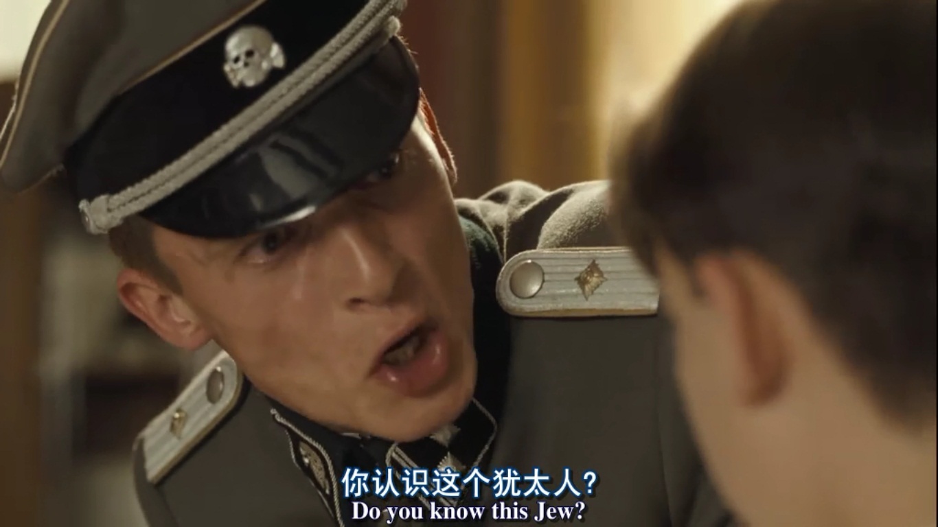
'The Boy in the Striped Pyjamas' has a very negative portrayal of Jews, as it is a film about WWII and Adolf Hitler was spreading the message that ethnic minorities, such as the Jews, were a 'contamination' and should be dealt with. The young boy Shmeul who is Jewish, is sent to a concentration camp where he will meet his death, and as this film follows mainly the White British people we hear their opinions, mostly negative, about the matter. However the main character is a young boy named Bruno who allows us to see a positive representation of Jews, for he befriends Shmuel and the audience is shown the friendship they develop and how despite his religion and background Shmuel is just a child. However Jews were shown, in general, as dangerous human beings who bring terror and misery to the lives of others. In the image Bruno is being shouted at for having  relation with a Jew, highlighting their negative portrayal.


Pitied-

This is the from the wreckage of the floods that hit  and devastated  parts of the Philippines in the December of 2014. The Filipinos were devastated and rendered helpless, and appeals were made to richer countries such as Britain to send aid through money, food and first aid supplies. The flood hit on the 5th December and the news was reported straight away by the BBC who put news articles on their websites with the title 'Philippines Typhoon Hagupit makes landfall as thousands flee' and coverage even before that with warnings of the flood. Clips were shown on news shows such as the BBC and ITV showing images such as the one inserted, which evokes sympathy, causing us to pity them. By showing children it creates more of an impact as we tend to feel more sympathy towards them, because of their vulnerability. 

Humorous - 

Ned Flanders is humorous because of his over exaggerated religion and the events that occur because of it. Flanders is the Christian neighbour to the Simpsons family from the popular TV show on Sky, 'The Simpsons'. His need to share his beliefs becomes comedic because of Homer Simpsons reactions, as he is completely disinterested and doesn't fully understand the concept of Christianity. By adding a humorous character such as Ned, who has a recurring role the audience become familiar with him and expect comedy when he is around. I don't think it is particularly a positive or negative representation, for though he is mocked, it is not exactly commenting on the religion itself. Having said this it is hardly illustrating Christianity in a positive light and as something appealing, for they are only portraying one type of Christian and he is shown as slightly crazed and over the top.

Sexualised -  


In  the media, artist 'Rhianna' is often sexualised, and even sexualises herself. One reason for this could be to make her appear more appealing , or to highlight her womanly assets. If you were to see this in a positive light then she could be seen as expressing her confidence and telling women that it is okay to love your body. In this image she is on a shoot for magazine 'Esquire' in 2012 and this image is very sexualised, the lack of clothing for one but also the water used to add shine to her body makes for a more sexually appealing image. The magazine is in that nature but she made that decision to appear on it and it was one that affects the way she is portrayed in the media. In some ways this is a negative representation as she is a role model and teaching young girls that it is something 'that is done' to perhaps become more famous isn't morally correct. However as I previously said, it shows that she is confident with who she is and that is a positive message to portray. It doesn't have any negative connotations with regards to ethnicity, because white females sexualise themselves also.


Race and Ethnicity


Glee- Unique Adams/ Wade Adams


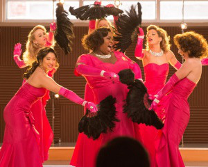
This is a positive representation of race as they don't draw attention to it and make a big deal of it, instead of questioning her background they except her for her. Other issues are portrayed through her, as she is the first transgender on the show. Unique was born male and named Wade, but since growing in confidence she now prefers to be referred to as a 'she' and she identifies herself as Unique.  She is an American and the colour of her skin is black, which is such a positivity in the media as discrimination was a massive problem especially in the U.S.A. Unique is portrayed as a stereotypical black woman in certain aspects because she is confident and has a very powerful and soulful voice. She is also a larger lady and loves her body which is typical of a black woman but also positive because it is emphasising that we should love our bodies; especially as she is a role woman for millions of teenagers. Unique is a fairly humorous character on the show, however she is also pitied at the beginning when she comes into the show as an unconfident and insecure male who feels trapped in their own body.   


This image shows unique in her element, she is performing with her friends and it is here that she feels most confident and accepted. She is sexualised here as she is in a figure hugging, hot pink dress with feathers, which have connotations of jazz dancing. 

In this scene she is super confident and happy, adding to the positive portrayal.


12 Years A Slave- 

In this film the White Americans are portrayed as the nasty villains, opposed to the Black Americans who are usually portrayed negatively. The owners of the slaves are white and they are the ones who are psychically abusing the Black American Slaves. In one particular scene, despite the slave trying to stand up to the White American slave owner, he goes ahead and rapes on of the pitied female Black Slaves. This is a negative portrayal of White Americans for they are being illustrated as dangerous and villainous, compared to the Black Americans who are pitied. 


The black women are presented as strong for carrying on in those conditions, where as the White American women are conveyed as weak for just following the orders and not questioning the thoughts. 


Friday, 13 February 2015

Analysing Film

All Good Things


This particular shot is part of a shot, reverse, shot to add a conversational feel to the dialogue. It allows the audience to see how they react to eachother as well as there interactions and proximity which can give hints of their relationship.By being able to see the main characters reaction we can perhaps judge on future events.
The lighting is natural using the sun, which adds the feeling of happiness and easiness to the scene. The slight shadows add a realistic effect and by using the sun it also illustrates the season they are in. The soft lighting used results in a low contrast to express this supposed happy tone.
The characters are placed in an attractive place in the rule of thirds, making this shot pleasing to the eye. Both characters are also in shot which adds to the conversational tone of the scene; however the fact that the shot is more focused on Gosling's character shows the audience that he is the character we are meant to be focusing on.
The white clothing could connote purity, however from previous shots we know that they have just finished a game of tennis so the clothes are apt for that situation. Also, the game of tennis is an important feature in the film because it appears earlier on in as major flashback as a child.

Friday, 6 February 2015

This Girl Can 

Women Empowerment 


This advert was produced to beat inactivity and to help empower women to support the feminism movement.  The vast array of women help this video become relatable to all female, including a range of sizes, ethnicity and ages. Throughout the women are shown as strong, powerful and capable- this is aided by the high key lighting which has connotations of strength because of the brightness. The use of close-ups creates a sense of realism because you see the facial expressions in detail and the audience get a feel of how much they have pushed themselves and how proud this is making them feel. The sweat is also highlighted by the high key lighting and close ups which, personally, i believe helps to create a sense of bravery and strength for they are not caring of what others think and are comfortable in their own bodies. The smiles on their faces also help create this sense of empowerment and strength because they are happy and it has a positive effect on the audience for smiles are contagious ; this leads to the overall positive representation of women and exercise which was create to empower and encourage women. The use of the music 'Get Your Freak On' by Missy Elliot is important for it adds to the idea of independence and success that this video implies. Elliot is a motivated and powerful woman who has succeeded despite her size and race, which would have been looked down on only several decades ago. This is down to videos and ideas such as the ones this text employs, for it helps to create a stronger movement in which ideas blossom and grown until they are accepted by all.  When the track pauses for a moment in the music video and the diegetic breathing is highlighted it helps, again, to create a sense of realism. Also when the music starts up again and the women continue on their journey it illustrates just how motivated they really are because they didn't give up, even when they thought they had reached their limit they carried on pushing- to me this demonstrates true strength. This video effectively supports the feminist movement for it's target audience is largely women and through the technical codes and styles the media producers have created this sense of empowerment that will motivate women. Another big aim for this video was to encourage exercising within the community, not only women, and through the array of people portrayed in this video, I think all would have found it appealing and empowering.

Friday, 14 November 2014

Research 

From creating and sending out a questionnaire, it helped me collect information from my audience about what they wanted in a music video, so it helped me when deciding what to put in mine. Questions such as “Do you like to see people from your age range in a music video?” and “What is your age?” are useful because it gives me an idea of who I should put in my music video, most people were between the ages of 14-24 and said yes, hence I will have people from that age range star In my music video. Also from researching other indie-pop artist’s they usually have themselves or others tar in their video who are around the age of 18-25, therefore it fits with my genre and what the audience want.

Textually analysing other artist’s music videos also gave me ideas of shots, as well as editing and lighting. I didn’t just analyse music videos that I wanted to use as inspiration, but by analysing a music video with a faster beat to get a wider knowledge. By watching and analysing Ed Sheeran’s music video for ‘Thinking out loud’, it has given me a better sense of onscreen love and shown me ways of showing this, for example eye contact is a very important aspect. From analysing Taylor Swift’s music video ‘Begin Again’ and looking into some of her others I really like the idea of the two shot to highlight the romance between two people, especially as you have one person’s shoulders and the other person’s face so the scene appears more realistic. I also like the idea of having shots, not only of the artist singing, but also of them in the same spot but looking away as this adds a more interesting dimension to the video as well as giving a more thoughtful edge to it. Also, from textually analysing music videos I have realised how important setting and locations are in a music video, especially in George Ezra’s music video where he uses pathetic fallacy to convey his mood, I have taken inspiration from this and decided that when there are happier moments within the song I shall use high-key lighting but as the song becomes sadder and when the boy is left along the lighting shall become dimmer to reflect his mood.

From researching both the audience’s desires, and what previous media producers have created, it has helped me arrive at the conclusion that I want to aim my music video mainly towards teenagers and young adults; as well as have a main love story running throughout. My target audience is such because the majority of people who watch music videos are from this age range, also my idea will appeal mostly to this audience. The love story will be between a teenage boy and girl, but from the boy’s perspective as he is the one singing the song, which shall be ‘Beautiful Tragedy’ by Mike Dignam.


(493 Words)

Wednesday, 5 November 2014


Taylor Swift- Begin Again

Textual Analysis

Taylor Swift's begin again, has a vintage film over the shots to co-inside with her more vintage costumes and mise-en-scene.
The opening shot is a long shot showing the main character, Taylor Swift, looking over a bridge showing the settings of Paris, suggesting she is glancing thoughtfully setting the tone for this music video. This shot lasts for three seconds and could be interpreted from somebody's point of view as the camera is slightly shaky suggesting its hand held, though it still looks professional.
The next shot pans upwards revealing Taylor to co-inside with the lyrics, this shot lasts for eight seconds so it can do so, but also reflects the peaceful tone of this song as slower and longer shots are used.
This then moves on to a second location within Paris, by a dockyard, where two shots are used, one a mid shot and the other a close up both of from the same angle and focusing on the same aspect; this brings the audience into the video and shows us both the scene and detail whilst showing the personal side to this video.
An establishing shot is used next, with quick but smooth editing in between and due to the length of the shots the transition doesn't appear choppy. Again another location in Paris is revealed, showing the audience everything fro the beginning; to add continuity there are two shots straight after each other like before, the first is the extreme long shot and the second is closer but is still a long shot. This then transitions into a third shot in the same location but from a side angle, creating a more complex video for the audience, despite the simple ideas and similar locations. This type of shot also reveals more of the outfit as its a long shot and from a different view.
The costumes use 1950s inspiration to create a vintage feel that is continued all throughout the text, Swift's hairstyles are very representative of that era also.
The rocky and shaky style of filming is still used when we cut to a close up of Taylor singing back at the bridge location, all the other shots not in that location are filmed with a steady hand, perhaps in the story the river is where she began was 'shaky' from her previous relationship, thus this is paralleled through the choice of shot.
At 00:27 seconds we are first introduced to her 'love interest' from an over the shoulder shot focusing on Taylor, we do not see his face but it becomes absolutely clear this is a love song, if it didn't from the words.
The lighting throughout the video is high-key to represent how Swift has re-discovered the love and happiness in her life.
The audience is then introduced to a fourth location in Paris with Taylor riding a bike, again wearing 1950s inspired dress; similar to before there are 3 shots that take us on a journey through this location. The first is an extreme long shot, before going into a medium long shot then a mid shot, again drawing the audience in to her story. The continuity of the three shots becoming closer each time gives a professional edge to the video.

A six second shot follows focused on Taylor singing the lyrics, having her in different locations singing the words reminds the audience that this is still a music video, buts adds a sense of complexity. Because the next shot returns to her sitting by the river, this time with her singing it ties all the locations together and gives the audience reasoning for her introducing us to the location.
The locations help to reiterate the 1950s vintage theme because it considered as a cultural and peaceful city; it is also famously known for being the 'city of love' which reflects her happiness now she has found love again.
An interesting shot is used at 00:45 seconds,
Taylor is again in a new location but this time we are shown she is in a clothes shop through a perspective shot; it is almost as if the audience are watching from a shop window, we see Taylor picking out the clothes and the clothes rail is placed in front of her so to set the scene. That shot lasts for 2 seconds before moving us into the shop showing the real Swift and her reflection in the mirror whilst she's picking out clothes- we see shots of her holding up clothes, both lasting 2 seconds as this is not part of the main story line of two people in love, but adds depth as we are seeing more of her life. Neither outfit appears anywhere else in the video, most females in the audience will be able to relate because they search for clothes they like but never have enough money to buy the clothes or simply just can't decide.
We then have some shots of Swift singing, none of them lasting too long as we are shown 3 locations, again conforming to the three shots that are continuously used. After that we are not shown anymore singing for 8 seconds, but are introduced (by three shots) to more of her love interest's face, the bridge but this time for below it, and the new location of the coffee shop where she first meets her new boyfriend; these shots last longer, on average 3 seconds, because they are more focused on the story and not the lyrics.
01:07 is a poignant moment in the music video, as it's the first time we are properly introduced to her love interest, we see his face and catch the first moment he looks at her through an over the shoulder medium shot. It's important to notice that we are introduced to him a quarter of the way through the video, this is to illustrate how she was lonely and upset from her previous relationship, but he came into her life and cheered her up- the minute at the beginning represents her time alone. 
A two second shot precedes this which is a medium close up of her belongings on the coffee table: a cup of coffee, orange juice, a glass of water, photographs, a small notebook which she is writing in and a book. All of these objects conform to the 1950s themes as they have a vintage look about them, and nothing from the modern day is there, for example a mobile phone.
The three shot rule is broke during 01:12- 00:22 as four shots are used of Taylor singing, though there are only three locations, so it could be argued it still conforms.
At 01:25 the producer has decided to use a one second mid shot of the man standing up, before quickly transitioning to a tracking shot lasting 4 seconds showing his approach to Swift- the short shot represents the fact that this is the action in her life and paired with the tracking shot gives a sense of 'this is the moment' as the audience are brought along the journey. This is then followed by a shot mid shot of Taylors reaction, quickly capturing this precious moment before there being a long shot showing some of the landmarks and scenery in Paris- this could represent how it came in a whirlwind and now she needs time to process all of the action that has just happened, it creates a contrast to the short and tracking shots.
The fourth shot after this moment shows Taylor smiling and looking behind, almost showing how she ahs left everything in the past and now it's time to be happy again. This then leads to a glamour shot of Taylor dressed up in vintage clothing with the signature red lipstick. The second classy shot is a medium long shot that reveals she is sitting on a roof with the Paris skyline in the background, highlighting how she feels on top of the world now she is in love.
At 01:46 we are then taken back to the café to reveal more of the story, here there are 4 one second shots to illustrate the action happening and add continuity to the piece as before the shots were shorter in the café. It could be said to mimic the fast pace of someone's heartbeat when they're falling in love.
The next three shots show Swift with a more solemn face, this is because it links with the lyrics 'you don't know why I'm coming off a little shy, but I do', here she is referring to her previous relationships that have disintegrated and left her with trust issues; again the rule of three is being used.
The audience then sees a close-up of her new love interests face and he's smiling to show he's not going to hurt her, he's looking at her and smiling, taking a photo because he wants to savour her; Taylor returns this smile which shows she is recovering and like the title suggests she is beginning her journey again.
After another classy shot on the roof top showing her smiling, we follow Taylor along her journey on her bike as she rides through the streets on Paris. We then see where she is riding to, because after an intimate shot of her with her new boyfriend, we are shown a new location which is a bakery shot- we can tell it's where she rode because she is in the same outfit. The producers then decided to show us three shots, one of Taylor looking at the cakes, another a close up of the cakes so we know what they are, and a third of her buying one.
A quick transition to the café uses shot reverse shot to represent a conversation- we get a medium close up of Swift laughing, then her boyfriend, then make to Taylor, the laughing and eye contact shows how they are falling in laugh and everything is becoming better in Taylor's life.
All throughout this music video there is no additional sound, only the non-diegetic music that is added on top.
The story then reverts back to the bakery where we get a medium long shot of Taylor in high key lighting enjoying her purchase and looking thoughtfully about her time at the café (we can tell she is thinking about that because she is smiling, wearing the same outfit, and the preceding shot is them in the café, suggesting it is a flashback).
Now they are sitting next to each other, laughing and chatting, and he has taken off his blazer to signify they now feel more comfortable around one another.
Similar to before when the clothes shop was introduced, the camera is placed behind a bush at 02:36 revealing the main character more slowly and giving information about the surroundings, it also makes the video more interesting because a variety of shots are used.
The mise-en-scene has a classy feel to it, so when an extreme long shot is used to show them walking side by side, it is fitting that there are 1950s inspired cars in the background to fit in with the vintage theme.
This shot is then followed by two shots of the same style, one from behind him focusing on Taylor and the other behind Taylor catching his reaction; I really want to use this as inspiration for my music video as I hope to focus on a relationship and this captures it perfectly.
The three second shot that precedes this has sexual tones as she moves her hands down her legs and smiles showing how content she is.
Two shots that are very effective in this music video are the long shot of her walking on the building tops, this portrays how she feels on top of the world and in control whilst setting the scene, we then see a mid shot in the same location which highlights her facial expressions and emotions. The use of these shots together build up a strong depth in the music video.
Another use of the two shot is used, which demonstrates their love for each other as they are looking longingly at one another, because the shoulder of the other person is in the shot it also brings a sense of unity to the piece and fits perfectly with her love themed story line.
The shot of her letting her dress go in the wind at 3:10 illustrates her letting go of her past and her old lover, it also suggests that now she is free as she has the opportunity to feel the wind run through her which is a typical aspect associated with freedom.
The editing and pace of the shots speed up as it nears the end of the video, with shots lasting on average 2 seconds, this is because the song is reaching it's climax; and all is well again so there is less of a solemn feeling.
Having said this, it is then contrasted for effect with a 5 seconds long shot followed by a 3 second reaction clip, here neither of the actors are speaking which adds to the effect. Plus the romance is clearly shown here as neither are speaking just using eye contact to communicate, they are also within close proximity; his reaction of nuzzling into her is a very protective and caring response, again reiterating their love.
The three second, medium close up at 3:42 is a powerful shot in the video as it takes the audience back to the beginning, as Taylor was originally staring over the bridge. This shot also sets up the ending of the video effectively because she does not sing any lyrics after this, she simply smiles and shows her happiness on her own and with him- highlighting the fact that she has found herself to be content in both areas.
The last shot of her looking at him and smiling sums up the message of this music video, she wanted to show that you can find love and happiness again, even if all hope is lost.
The fading out of this shot creates a gentle ending, dismissing all harshness from the video as it is a story about love. The fading illustrates that this story hasn't ended, it's just not caught on camera anymore.









Thursday, 23 October 2014

Ed Sheeran - Thinking Out Loud 

Textual Analysis

The extreme long shot at the beginning shows how this video will be set in a posh location, because of the red curtains and staging. The dancer also sets the sexual tone of the piece as she is dancing provocatively but professionally, again showing the classy feel to this video.
The whole video has a vintage feel to it, even the camera techniques were vintage and it was filmed in an old style to add to this. The slow editing also fits into this as it is a slow and romantic tone, which reflects the mood of the piece as a whole. One shot at the beginning lasts for 18 seconds, but after 10 the camera zooms in from an extreme long shot to a mid shot. This adds a gentle feel to the video and in a sense creates more passion between them and makes the audience feel as if they're watching two people fall in love, as it happens slowly. The expressions on their faces throughout show that they're in love as well as the proximity.
The camera often refers back to an extreme long shot including a lot of the background, highlighting the classy feel but also the fact that they are alone; these establishing shots also portray a lot of the dancing, which is the only movement that occurs in this music video so it is vital that the audience get to view it.
Having said this there are closer shots of the couple, such as a mid shot at 1:19, which portrays their intimacy  but we never get a closer shot than a mid shot, perhaps reflecting how a relationship is a private affair.
The lighting is quite soft and low-key in the background but with a bright spotlight on them both, this sets the mood for the whole video and reflects turning down the lights on a romantic date, and reminds the audience of the classiness. The background lighting comes from a chandelier, illustrating the posh mise-en-scene and high-class mood; where as the spotlights pick out the two lovers out of the whole room showing how they feel as if they are the only two that matter, connoting the idea that love conquers all.
For the first seven seconds of the video backlighting is used to highlight the silhouette of the women's body, emphasising her sexuality.
The first outfit we see is the woman's in a panning medium long shot that follows her as she walks, almost as if the audience are being taken on this journey, like her journey of love with her partner. Her outfit is white, perhaps connoting purity, it is also very modern with the back longer than the front- but there is an elegant feel to this outfit, mimicking the setting and adding to the overall tone of the video.
His outfit first becomes clear after hers, and it does not have an initial close up shot as she did, because it is his story about love and she is the important one not him. The males outfit very much fits with hers, he is wearing a suit to reflect the exclusive environment but is not wearing a blazer, again adding a sense of modern fashion to an otherwise classic outfit; but this also shows how comfortable he is around her, he does not feel he needs to be smart to keep her love.
At 00:46 there is a pan shot around a chic chair, showing more of their environment but this also takes the audience away for a moment and reminds them that this is a personal story about love. By including this shot the main characters seem in their own world, again highlighting the joys of love, linking with the lyrics of the song.
The transitions between shots are cuts, but because all the shorts bar the beginning are in the same location, it does not feel choppy but smooth. Also, having several shots that zoom in makes the transitions seem smoother, for example after the shot around the chair at 00:46, the camera zooms in for 4 seconds before cutting to a medium shot; because the zoom is so smooth and quick it sets the audience up for a close-up shot without there being any disturbance for the audience. The zooming and panning shots that are regularly used fit in with the dance routine as it involves the audience because they are seeing more than one side of the characters and scene.
The background at 1:20 suddenly brightens up a little, though it is still low-key, because the wall lights turn on at the same time as the music kicks in some more which is an important feature as the video must co-inside with the music and lyrics. Just after this occurs the camera then zooms in to a mid shot before lowering into a low angle which show them together as being more powerful, this is really important because the shot, music and lighting are all linking to create the whole video; the transitions are really smooth adding to the elegant tone.
There is no extra sound in this music video, just the non-diegetic song that is added over the top, though it is meant to be in the scene.
The medium, birds eye view shot at 2:09- 2:10 just adds to the wide range of shots used, but again makes the audience feel more involved.
The last shot is an extreme long shot from an almost birds eye view shot, to reiterate how relationships can make you feel like the only two people in the world. Also, the fading out at the end adds to the vintage feel of the music video, but also slowly transitions the audience away from their lives, just as it slowly brought them into it.
The editing, though it cuts fast, is done at a slow pace because this emphasises the classy and romantic feel of the video, which is important because if it was fast with short shots it would not fit in with the genre of music.
Despite this music video being in one location, because of the varied shots and intriguing dance routine the audience don't lose interest, but instead become drawn into the dancing and over all mood of the piece. So when I come to producing my own piece I need to use many different shots for just one location to add continuity but to also keep the interest of my audience.


Wednesday, 22 October 2014

Questionnaire Results


The dominating gender is female, twice as many females, 66%, completed this compared to 33% being male. This will influence the type of music video I produce, as I had thought about doing a romantic video and the fact that the majority of the audience are females it would make sense to do a more romantic video as it would typically appeal to the majority of the audience.


The majority of my audience are 14-24 year olds, representing teenagers and young adults, which ties in with the question ' Do you like to see people from your age range in a music video? ' as the majority of answers we from young people and 67% of the answers said they wanted to see someone from there age range, the only participant who was between the ages of 35-44 said 'yes' but even with that answer detracted there will still be 7 people aged between 14-24 who , concluding that most people of that age want to see someone their own age in a music video. This will work with my idea of showing romance throughout the video and I can use a young couple to portray this.

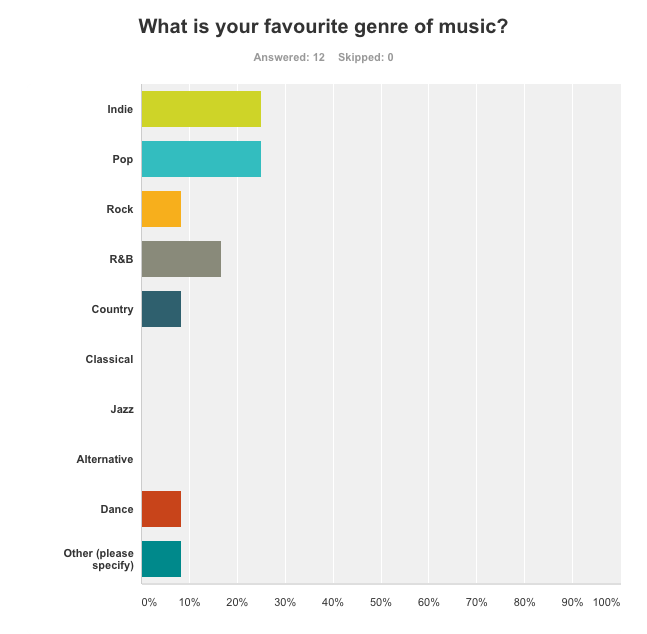
The two most popular genres are 'Indie' and 'Pop', but the whole answers were varied, showing how the audience how a wide taste in music. I will produce a music video to an indie song as I believe that will fit best with the idea of a romantic story line, though the song does have some pop elements in and the artist has produced pop songs in the past, therefore more of the audience will probably be aware of him, thus they are more likely to watch.  To co-inside with the indie genre of music I will also use natural locations, one being in a forest, so it connects more with the song and it will probably be more appealing to the desired audience.

Nobody chose live footage, which co-insides with the theme of romance and an indie style, because I did not want to focus on a live concert but instead wanted a story running through, which was the second most requested feature with 50% of the participants choosing this. As 'The artist' was the most requested element to be on the video I will insert clips of the artist singing on their own as well as the artist playing the male love interest in the story. I don't want to over complicate the video and by analysing the results from my questionnaire 33% of people stated they wanted a simple idea, so I came to the conclusion that to both fit with the genre and the audience I will create a simple story of love, as to not over power the song. 


I will use multiple locations, as nobody who participated in the questionnaire said they were interested in the music video just being shot in one location, and from researching music videos there are rarely any videos with just one setting. I also feel as if the video will be more interesting if it is shot in multiple locations, and my audience will be more appealed to it. I am thinking about using the woods as a setting, as well as a bed because that connotes romance and a gathering on bonfire night.


I did receive mixed responses from this question, but the majority said slow paced editing by 6 votes to 5 which also reflects the editing that both a romantic video and a music video from the indie genre would need. Some reasons were because you 'can focus more on the music' and it's 'easier to watch/understand'. 


I also asked this question last as a more open question just to see what my audience were interested in, the responses I got were very varied (this reiterates the question about favourite music genres). However I researched some of the responses and there was no just one location used. In Demons by Imagine Dragons they also slowed down some of the shots to create more of an impact, I really liked this idea as it also fit in with my chosen genre of music as this video was indie. 5 Second's of Summer's video Amnesia, despite it being from a pop genre, still used features that were transferable to an indie music video- there is a point where one of the artists is in a room on his own, the next shot is then of him with his friends in that same room laughing, almost like a flashback, which stirs emotion within the audience; which will go with my song as it talks about a relationship with both a sad and hopeful tone.


Friday, 10 October 2014

X-Factor Auditions

Sondesh Kumar


The producers decided to include this clip because it adds humour to the show and conforms to the X- Factors aim to entertain and offer escapism.
Throughout there is fast editing because the don't want to spend ages on him as he is not very good and is only there to be laughed at; therefore they only include the funniest clips and edit most of his audition out.
Tulisa introduces him and already before he has even sung there is a mid shot of Kelly looking weary about this performer, hinting to the audience that he won't give a very good performance. 
Sondesh then replies to Tulisa with what is made at as a humorous answer, he believes he can be compared to 'Jay-Z, Lady Gaga, Prince', which the audience view as funny because the producers have already hinted he won't be very good through the reactions from the judges, fast editing, but also because there is no back story or inspirational music; which usually appears on the fantastic acts, as the producers like to spend more time on them. Louis' reaction whilst Sondesh answers is that of confusion and disbelieving, which makes his answers that much funnier. It is also interesting that the same amount of time was spent on Sondesh's answers as Louis' reactions, showing that he is not that important and emphasising how absurd the judges are finding this.
He then spend around 5 seconds singing, which is shown in a long shot, highlighting how bad and awkward he is, but also showing his feet, hinting he is about to dance.
The next 20 seconds contain quick editing of Sondesh's awful dancing and the reactions from both the judges and the audience, showing them laughing at him, provoking the audience at home to laugh.
The lighting is high key, but it is throughout all the auditions for continuity.
Over-all, the fact that they spend less than a minute on him shows he is not very good or is going to get through.


Signs and Signifiers

Friends, with a little bit more...


When making this film poster we decided to focus and emphasise age (the youth of the main characters) and also sexuality. We were aiming to represent the younger generations; the woman from the middle class and the man from a working class background. The woman's boots show her middle class status, where as the man's trainers portray the working class. This gave us the opportunity to explore different classes from the same age range.
The position and proximity of the hands and legs show that they're not just friends, as the title suggests but they are close. He is typically sitting how a male would sit, for comfort; where as she is sitting with her legs crossed, a more feminine and formal position. Her hand is placed on his knee, suggesting that women are the more forceful ones and breaking stereotypes that men have all the control in a relationship.
The red blanket and his red shoes connote love and passion, but also danger, which hints at what would be to come in the film. This then links in with the red writing and the theme of love, it gives the poster continuity.
The watch on her wrist suggests that perhaps youth don't always have as much time as they think, just because they have lived less years it isn't guaranteed that they have loads more. Also, linking in with the use of the use of the colour red throughout our poster, because they could be in danger if they don't have as many years left as they presume.

We were influenced by both the TV show Friends and the film Friends with benefits, which helped us create our piece.


Textual Analysis

Company magazine


This magazine was released in summer 2013, which the by line informs us of; there are some hints on the magazine front cover to suggest it's a summer edition. For example the masthead is bright yellow, which is a colour connoted with happiness, but also because of the sun and longer daylight. This is also true of the anchorage text for the main image, because peach is seen as a summery colour as it's light and on the same scale as yellow; the words 'Haliee Steinfeld' also look highlighted in the peach colour, connoting youth because it relates to school, but also drawing the attention of the readers.
Company magazines are aimed at teenagers and young adults, between the ages of 15-25; we can see this because the cover girl is young and fresh herself, therefore relatable to the desired audience. Also the language is quite young and informal, the main cover line uses, 'road trip'(s), which are related to the younger generations as they have more free time and a greater sense of adventure. Cover lines suggest as to what age the audience are as well, 'bloggers' tend to be read by people in the age range as they are more technologically aware and also tend to have more time and care to read blogs. Also, the producer decided to not use capital letters, as this is seen as a young and hip thing to do, related with texting and social media as many young people tend to leave out capital letters, especially when tweeting.
The magazine 'Company', is aimed at females not only because of the colour scheme, or the fact that the main image is of a young female, but also the topics talked about- 'hair special' is only something that girls care for, and if it were aimed at men they would word it differently. The font of the writing is feminine, we associate curled writing with girls and not men. 
This cover is also very busy, with lots of images and text layered on top of each-other, this also hints at the age range because younger generations tend to have more active minds and can focus on more things at once, thus finding it more attractive; by using more images it also represents more of what is in the magazine and the fashion choices would appeal to the target audience and make them want to buy the magazine. 
The direct address from the main cover girl also entices the desired audience because it entices them in and makes them feel involved. She is dressed in fashionable clothes, which again appeals to the audience and parallels the modern yet classy feel of the magazine, but they are still true to her. The yellow coat connotes summer, which ties in with the special edition as it's a bright colour. Against the plain background she stands out and is the first feature somebody will see when they pick up the magazine because she's placed in the centre but is also on a slight diagonal which conforms to the rule of thirds.
The social economic groups that this magazine is targeted at are groups C1 and E, this is because the people from the target audience would most likely to still be in education, or in their first jobs- and because this magazine appears stylish, members belonging to groups C2 and D probably wouldn't care for it.